OPENTEXT WEBROOT
Enhancing security training insights
SAT campaign summary report


ABOUT THE PRODUCT

What is a "campaign summary report"?
Who is it for?
The campaign summary report is a feature provided as a part of Security Awareness Training (SAT) from Webroot that provides insights into the effectiveness of cybersecurity training campaigns and phishing simulations. Primary users of Webroot are managed service providers (MSPs) and IT admins who take care of IT for operations their clients. They are externally hired by mostly small to medium businesses who don't have their own IT department in their organizations.
Thus, it is MSPs' jobs to educate their clients on cybersecurity best practices.
THE PROBLEM
MSPs are having a hard time reading and resolving campaign errors, often leading to frustration and delays in campaign progress for their clients.
This can lead to a decline in training performance outcomes, making employees and clients vulnerable to cyber attacks.
SOLUTION PREVIEW
PROCESS OVERVIEW

EMPATHIZE
Listening to the voices of our users and being on their eye-level was crucial.
The project came to surface when my team was going over feedback they gathered from direct contact with customers. Most of the feedback had a similar theme, which meant that many users were facing similar challenges. It became clear that their pain points needed to be addressed, and these user insights were a good starting point for us to discuss priorities. This gave us guidance on where to start for the revamp of the campaign summary report.


“I wish I could interact with the data more, like filtering results or drilling down into specifics.”

“I have to scroll through a lot of irrelevant details to find what I need. It’s not efficient.”


“I don't always get what's written in the table. It takes some time to absorb the info.”
Based on user insights, I created Alex, a fictional persona, that represents the core users of Webroot. Laying out and understanding Alex's needs and pain points allowed me to focus on the critical areas that required attention. This persona served as a key reference throughout the project, ensuring that every decision was made with a clear understanding of the users’ real-world challenges.

IT Manager
Chicago, IL
Background
Alex works at an MSP that provides IT services to small and medium-sized businesses. His primary responsibility is to oversee cybersecurity solutions for multiple clients, ensuring that their systems are protected against threats and compliant with industry regulations.
Pain Points
Difficulty in interpreting insights
Challenges in communicating complex data to clients
Time consuming security training analysis
Needs
Clear visualization of security metrics
Insights easy to communicate to non-technical clients
Identify security training success/fail rates
ANALYZE


Critiquing the existing design with a fresh set of eyes.
Problem 1
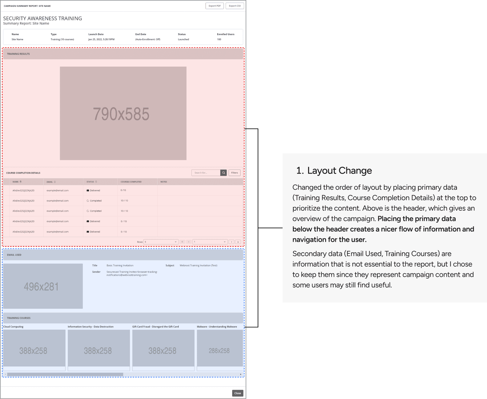
Lack of information hierarchy
Problem 2
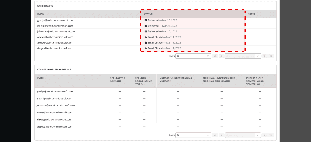
Unclear data visualization
Problem 3
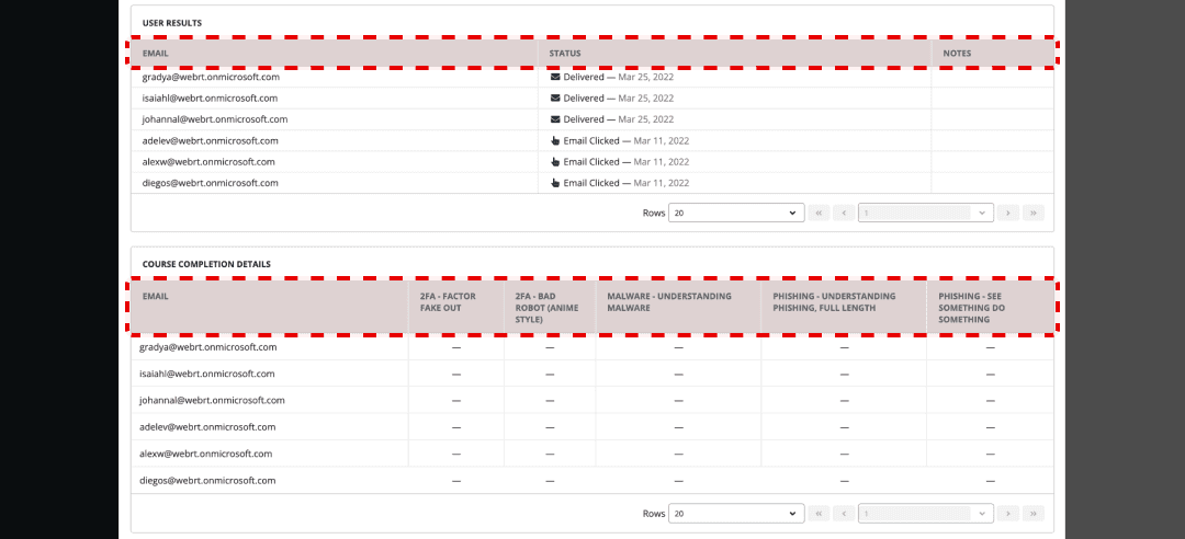
Poor table readability
Problem 4
Ineffective
layout
Lack of information hierarchy

Unclear data visualization


Poor table readability


Ineffective layout

Doing a quick assessment before moving onto brainstorming!
To progress to the next step, I decided to assess the old design using a UX principle-based approach, incorporating both qualitative and quantitative evaluation.
I chose Jakob Nielsen’s 10 Usability Heuristics as the framework for this assessment, as this was the most established guideline to follow. Given that my role was not centred on UX research, I was tasked with a general heuristic evaluation.

For the quantitative evaluation, I came up with a severity rating scale to rate each heuristic.
Significant usability problem that needs to be addressed
Important usability problem that needs to be addressed
Some usability concerns, but nothing critical
Slight usability concerns that may not need immediate attention
Follows the guidelines well with no usability concerns

DEFINE
What are the biggest challenges to solve and implement in Phase 1?
Once completing the analysis of the current single site training campaign, I had an understanding of the problems that users were facing on a deeper level. I thought about how the current design impacted our primary users (MSPs) and secondary users (the clients) not only during the experience, but beyond. On the surface, it was mostly superficial problems that were visible as discussed earlier, but once analyzing in-depth, I uncovered more profound issues that affected the overall usability and effectiveness of the tool. I then listed the challenges I determined were top priority to focus its improvement on for the redesign.
Helping MSPs interpret important information in a short period of time.
Translating complex data into bite-sized information that is communicable for both MSPs and their clients.
Allowing complex data to be handled in a flexible manner without tool constraints.
Distinguishing important information from supporting content while keeping the design minimalistic.
PHASE 1 GOALS
Translating key challenges into project goals!
Since Webroot operates as a B2B platform, it was essential to establish project goals that aligned with our users' business objectives. After discussions with the product manager, we identified four key project goals, each derived from the major challenges we uncovered.
Enhance UI accessibility for information.
Simplify complex data for easy communication.
Increase flexibility in data handling and navigation.
Keep a minimalist design while prioritizing key information.
DESIGN
First, we focused on making major changes.
Click zoom in for better readability🔍


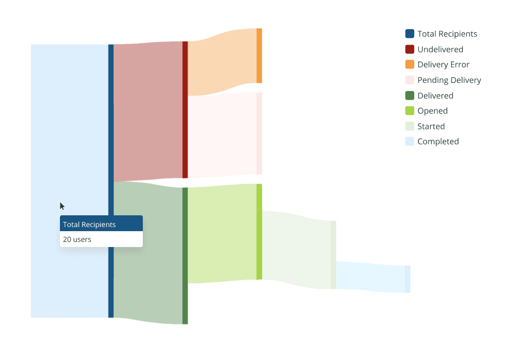
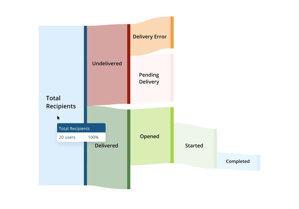
I was then tasked with creating different versions of the Sankey diagram.
We explored various options to determine which best illustrates campaign status with clear detail while maintaining readability.
Option 1
Sankey diagram with legend. There is no separate label to indicate each status on the diagram, and users can hover to view the number of users under each status.
Option 2
Sankey diagram with labels. Statuses are displayed on the diagram, and on hover, users can see both the number and percentage of users at each stage.

Option 3
Sankey diagram with labels and numerical data. Number and percentage displayed on diagram. On hover, a tooltip containing meaning of each status appears.
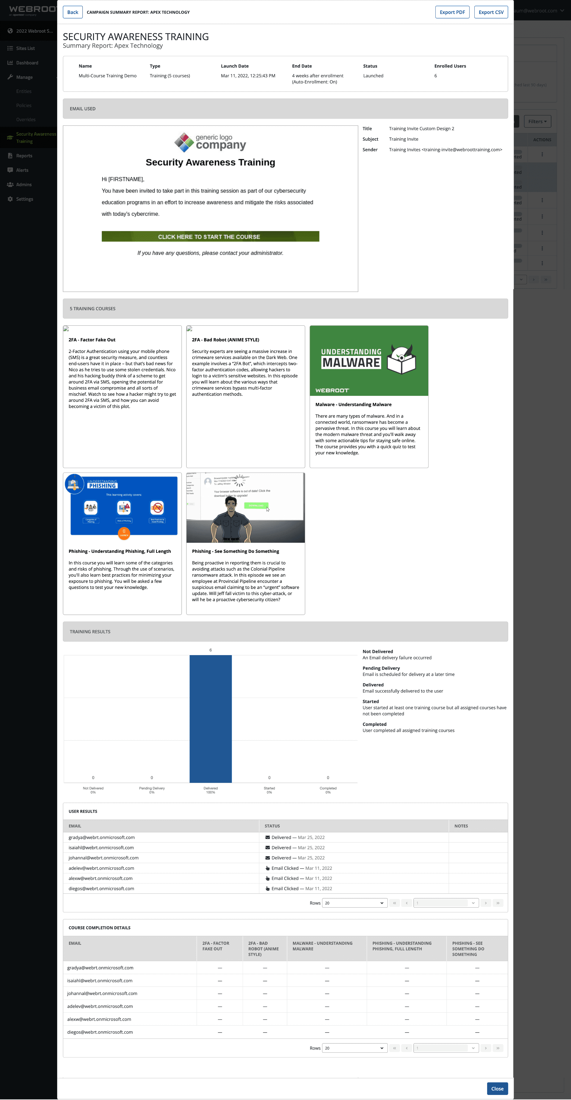
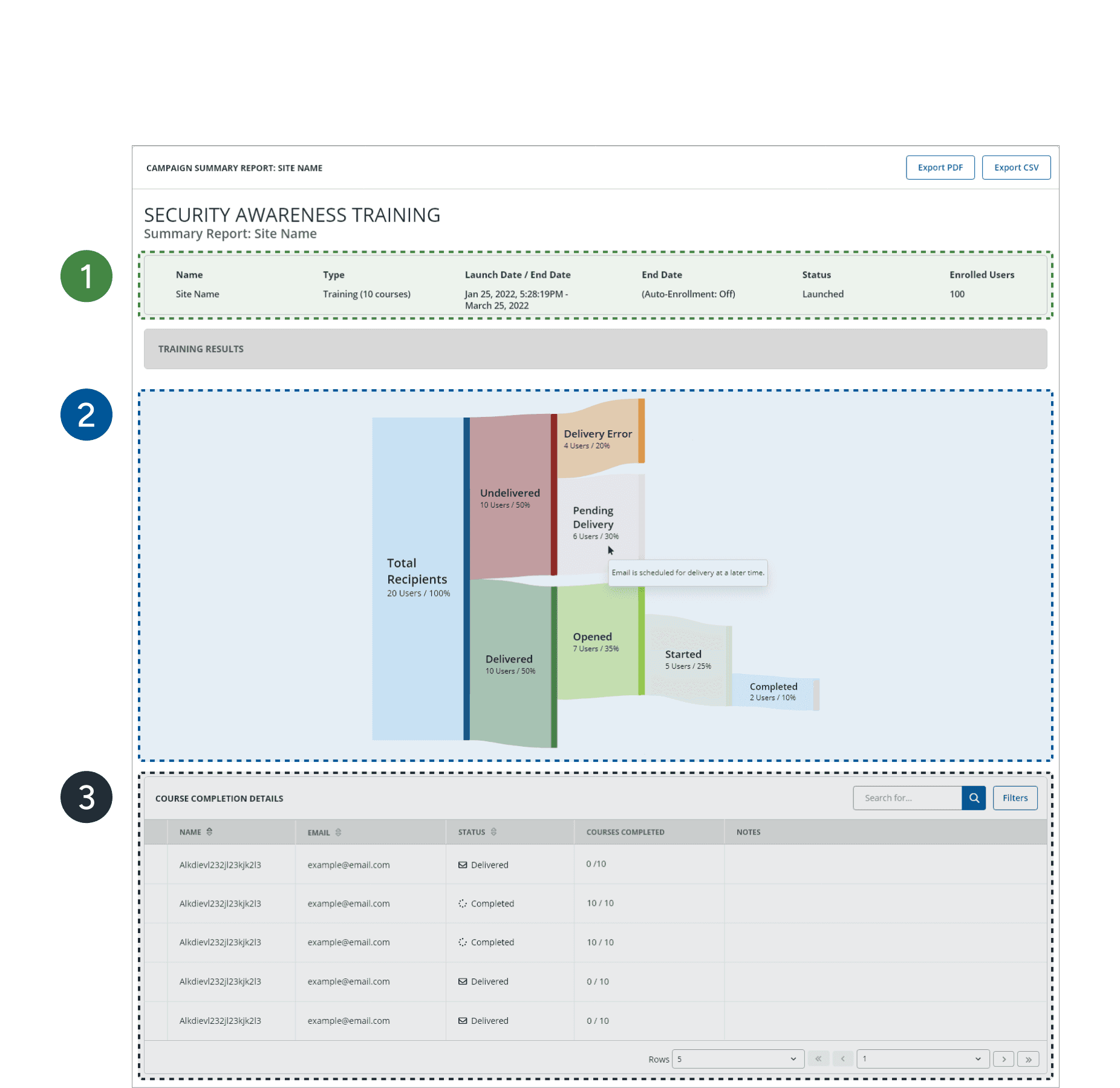
Redesign of single site report was ready for release.
Here are the improvements I made:
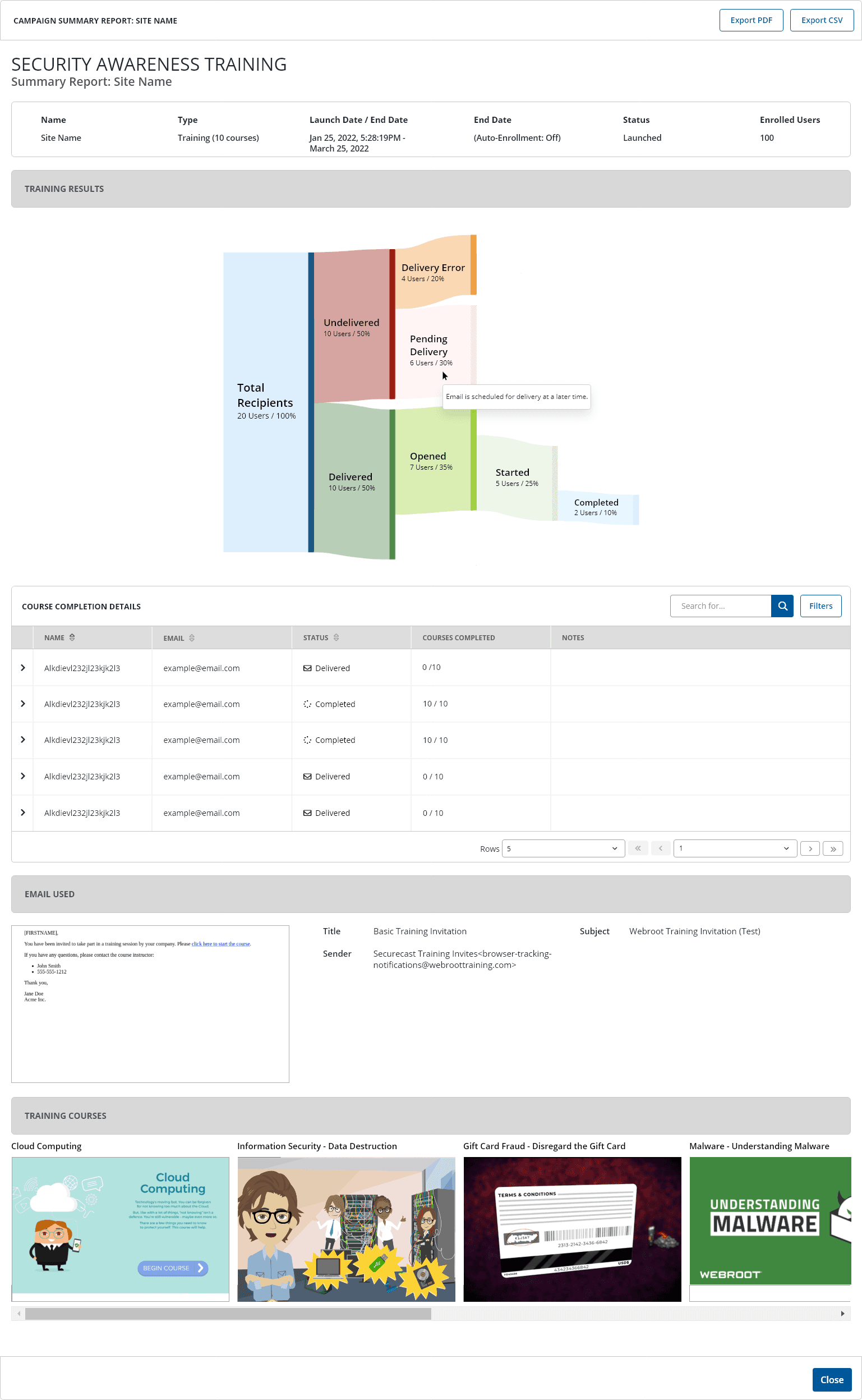

Sankey Diagram
We chose the sankey diagram with labels that displays a tooltip of status definition upon hover.

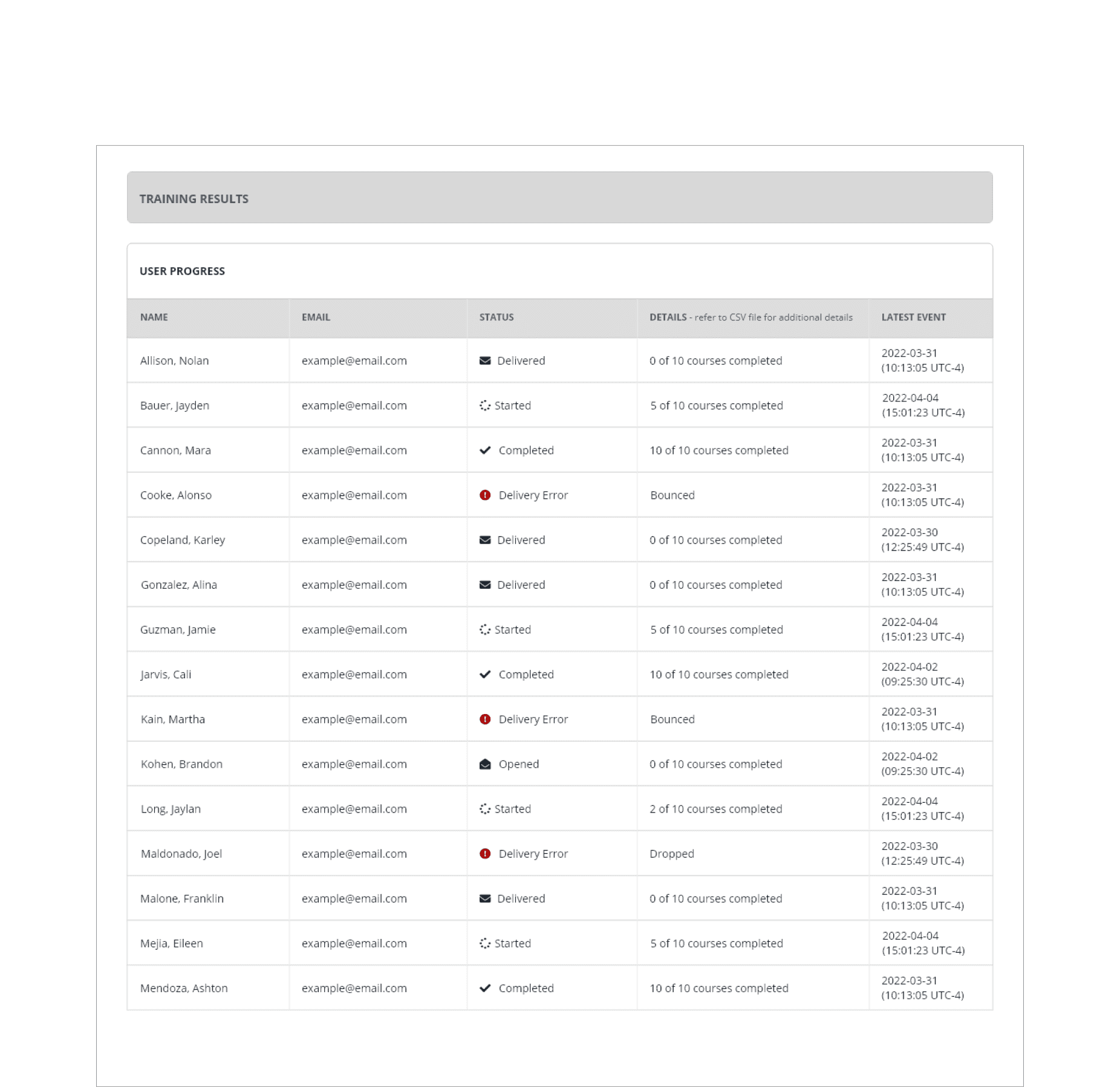
Course Completion Table
The new table was given a search bar and filter, as well as the number of courses completed.
Thumbnail Size
The size of the thumbnail was significantly decreased to use space more efficiently and to put emphasis on primary elements.

Courses Layout
Originally a grid view with detailed description, courses section was minimized with a horizontal overflow.
ITERATE
Gaining insight from existing users to prepare for Phase 2.
When we released Phase 1, we already anticipated on working on Phase 2 right away, as we had received additional insights on what users wanted to see and use in the campaign summary report. Before delving right into Phase 2, the product manager reached out to users to receive feedback for Phase 1 to use as a guide for Phase 2. Through this, we identified several pain points from Phase 1.
Phase 1 Feedback:
“The Sankey diagram is helpful for seeing the overall flow, but it’s hard to track progress at the individual user level. I need a way to pinpoint which users are facing what issues.”
“The visual representation of errors could be more distinct. It's easy to miss issues like delivery errors, especially in a busy report.”
“I like how the two tables were combined into one, but I feel like it's missing important info like error details.”
Phase 2 Requests:
“Changes in this release was a level-up. Now, I want to see the same improvements in multi-site.”
“Bridge the gap between what I'm seeing on screen and what is being printed. There's a lot of discrepencies in the PDF version.”
“When errors come up, there’s no way to take action directly from the report. I want to be able to resolve issues on my own without having to contact support everytime.”
SCOPING PHASE 2
Thanks to user feedback, the scope for Phase 2 was clear.
During our weekly Wednesday meeting, we learned that Phase 2 scope was bigger than Phase 1. The product manager discussed feature prioritization with the team, and this is what we decided to implement for Phase 2:
Independent error resolution flow
Delivery error acknowledgement feature
Re-send email feature
Multi-site report improvement to align with Single-site
PDF report redesign
To understand how users would navigate in the new design, I created a user flow.
New features and feature redesigns have been highligted!

Phase 2 introduced a significant number of enhancements compared to Phase 1.
Below are the before and after of existing features😎
Before
After

1
Header: Icons were added for visual representation of each category. Purpose of the colour was to bring in more attention to the header content, as it was easily missed.
2
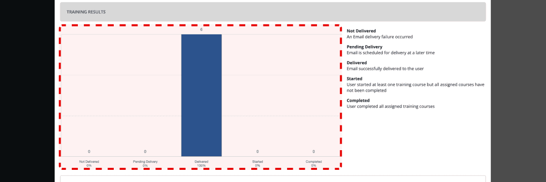
Data Visualization: Colours in the Sankey diagram were to mainly communicate errors, so the various colours in Phase 1 were removed and only blue (normal activity), red (error) and green (completion) were kept. Additionally, a segmented controller was added so users can switch between two kinds of charts: Sankey diagram and bar chart.
3
Table: Changed from Course Completion Details table to User Progress table. The previous table didn't provide any methods for users to resolve errors, whereas the new table allows users to acknowledge errors and re-send emails when necessary. They are also able to expand and collapse each row to view their clients' activity in more detail. The new table now displays accurate time for each activity, so users can manage their clients' trainings in real-time.
Below are designs of additional features✨
Multi-site Report

Designing the multi-site report for consistency.
The multi-site report is a feature that helps users set up training campaigns for multiple organizations simultaneously. At its core, the feature is similar to a single site report, but it gives a high-level view of a campaign before getting into the nitty gritty.
After I redesigned the single-site report, the team recognized the need to improve the multi-site report to ensure a consistent user experience and eliminate any discrepancies.
From multi-site, users can see which organizations are experiencing email errors or training delays, and which organizations had already completed their training.
PDF Report
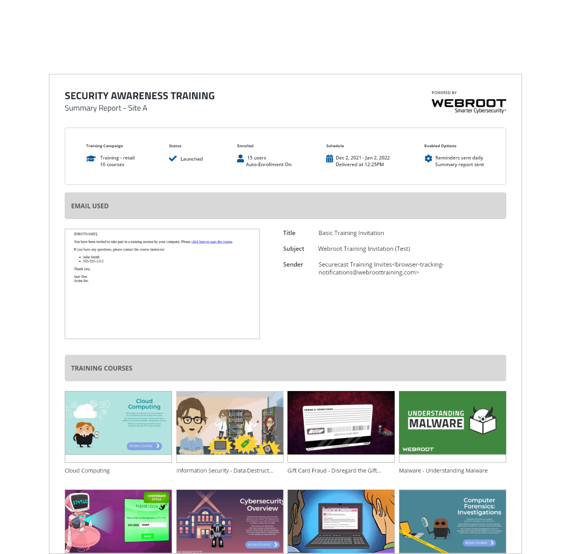

Thinking of the user even after the experience ends.
The PDF report is an additional report that is often used when users want to share training progress insights directly with their clients (organizations).
My task for the PDF report redesign was to bridge the gap between the digital and printed (PDF) versions of the report, making sure that the users and their clients experience consistent communication regarding errors and training progress.
IMPLEMENT
Gaining insight from existing users to prepare for phase 2.
When we released phase 1, we already anticipated on working on phase 2 right away, as we had received additional insights on what users wanted to see and use in the campaign summary report. Before delving right into phase 2, the product manager reached out to users to receive feedback for phase 1 to use as a guide for phase 2. Through this, we identified several pain points from phase 1.