UX/UI
Responsive Web
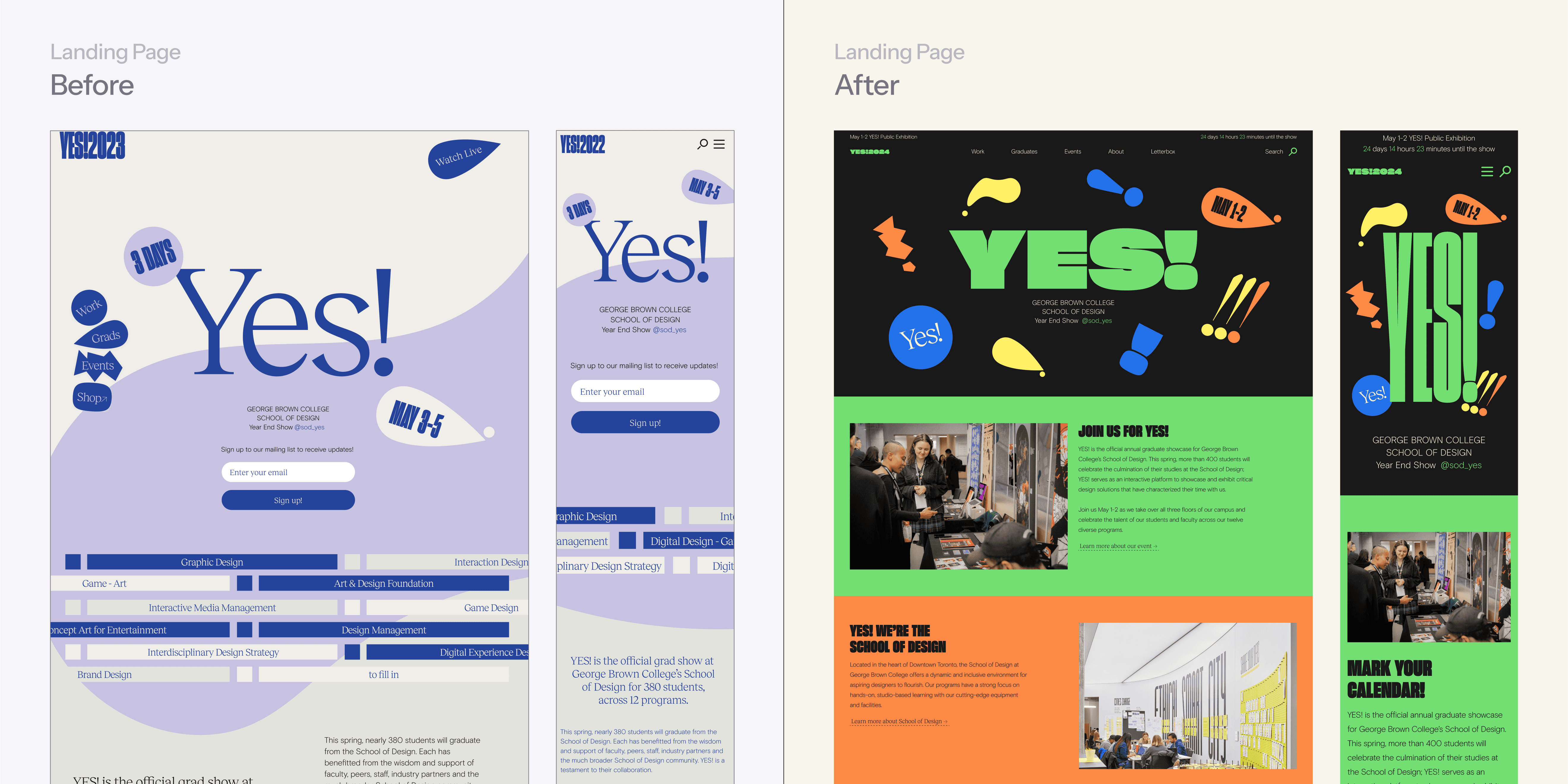
Redesigning the graduation showcase website
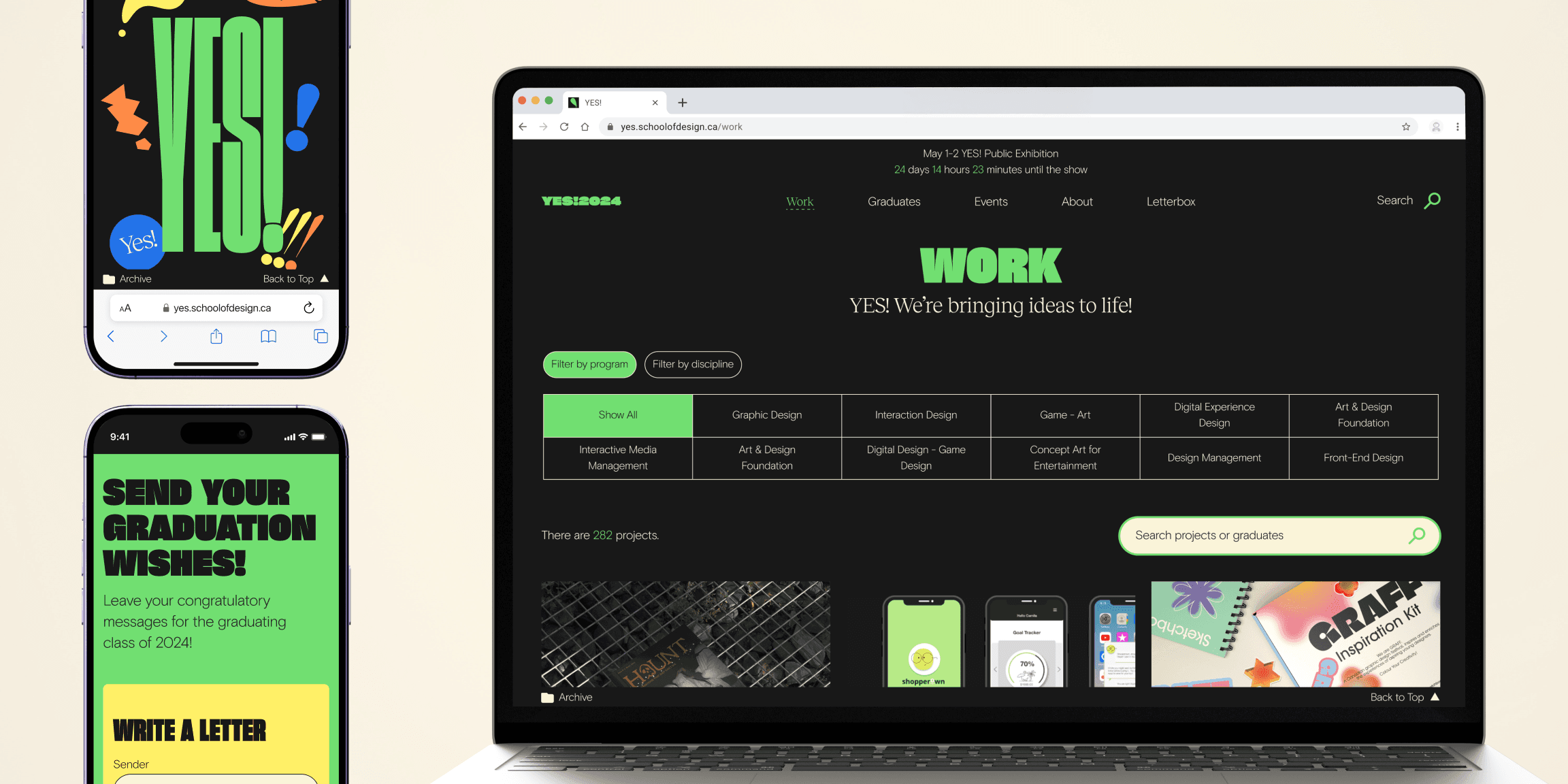
The YES! website was designed for George Brown College’s annual grad show, aimed at providing easy access to event and graduates' information.
As a website committee member, I collaborated with fellow designers who each had unique skills. Being a part of a multi-disciplinary team enabled me to experience the full project lifecycle, starting from usability testing and ending with quality assurance.
Core Skills: Collaboration, Agile Methodologies
Role
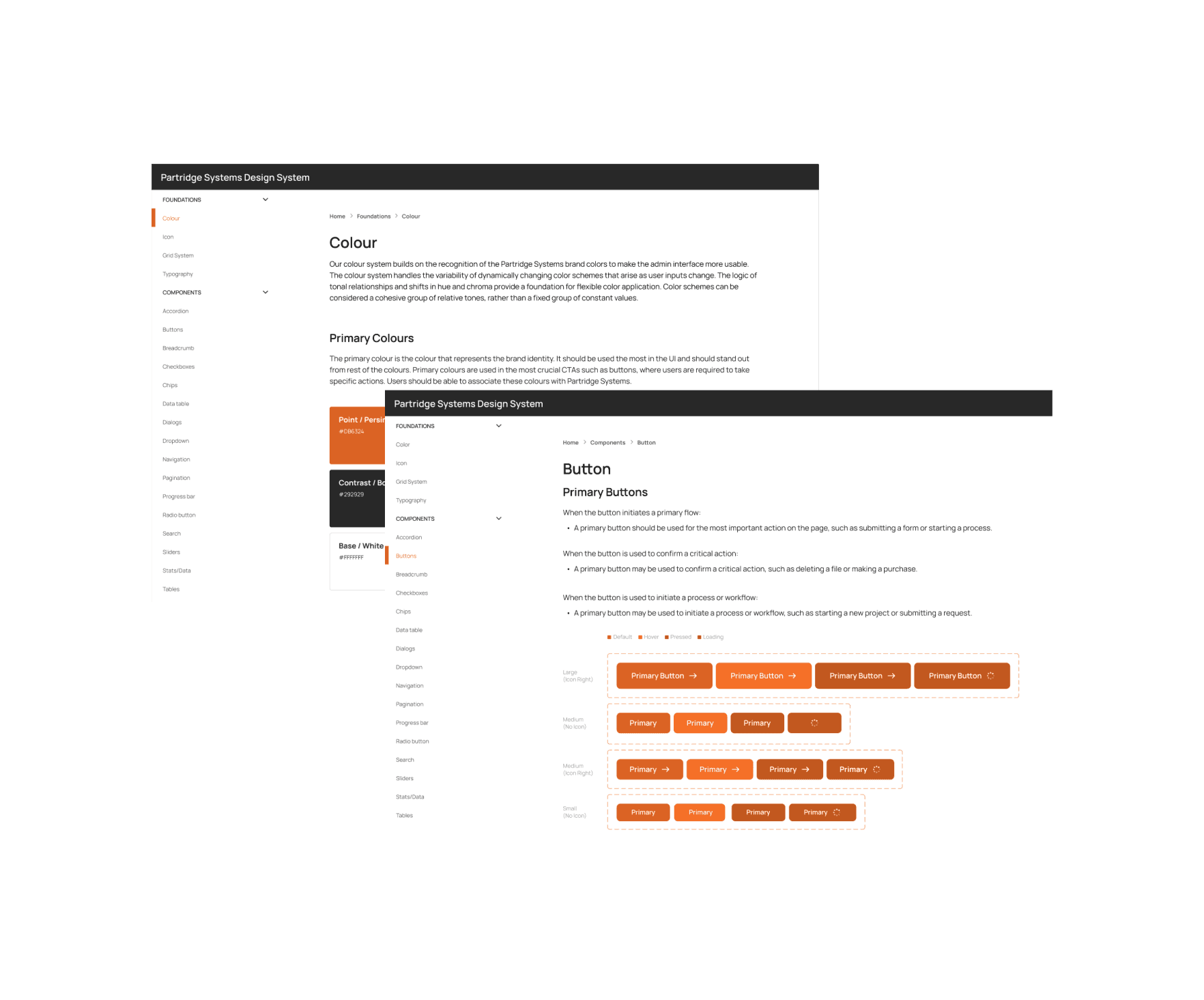
UX/UI Design
UX Research
Design System
QA
Outcomes
96% effectiveness rate
64.3s average time on task
88% satisfaction rate
Team
4 Designers
1 Developer
Duration
3 months

Problem
Challenge
Approach
Solution
Solution 1
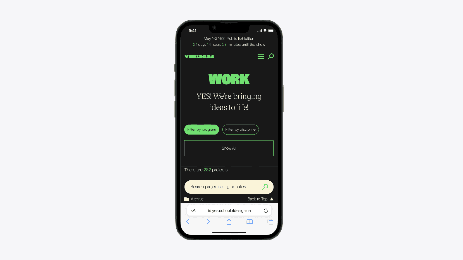
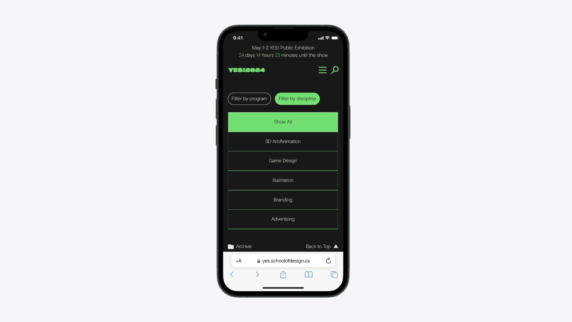
Enhanced student work visibility and navigation.
The Work overview page features improved navigation with an organized layout, better filter visibility and a prominent search bar, allowing users to easily browse through projects.

Solution 2
Improved work page layout for better work presentation.
The Work details page features an organized layout via proper information structure with visual clarity regarding student name, student photo, program/discipline and the story behind their work.

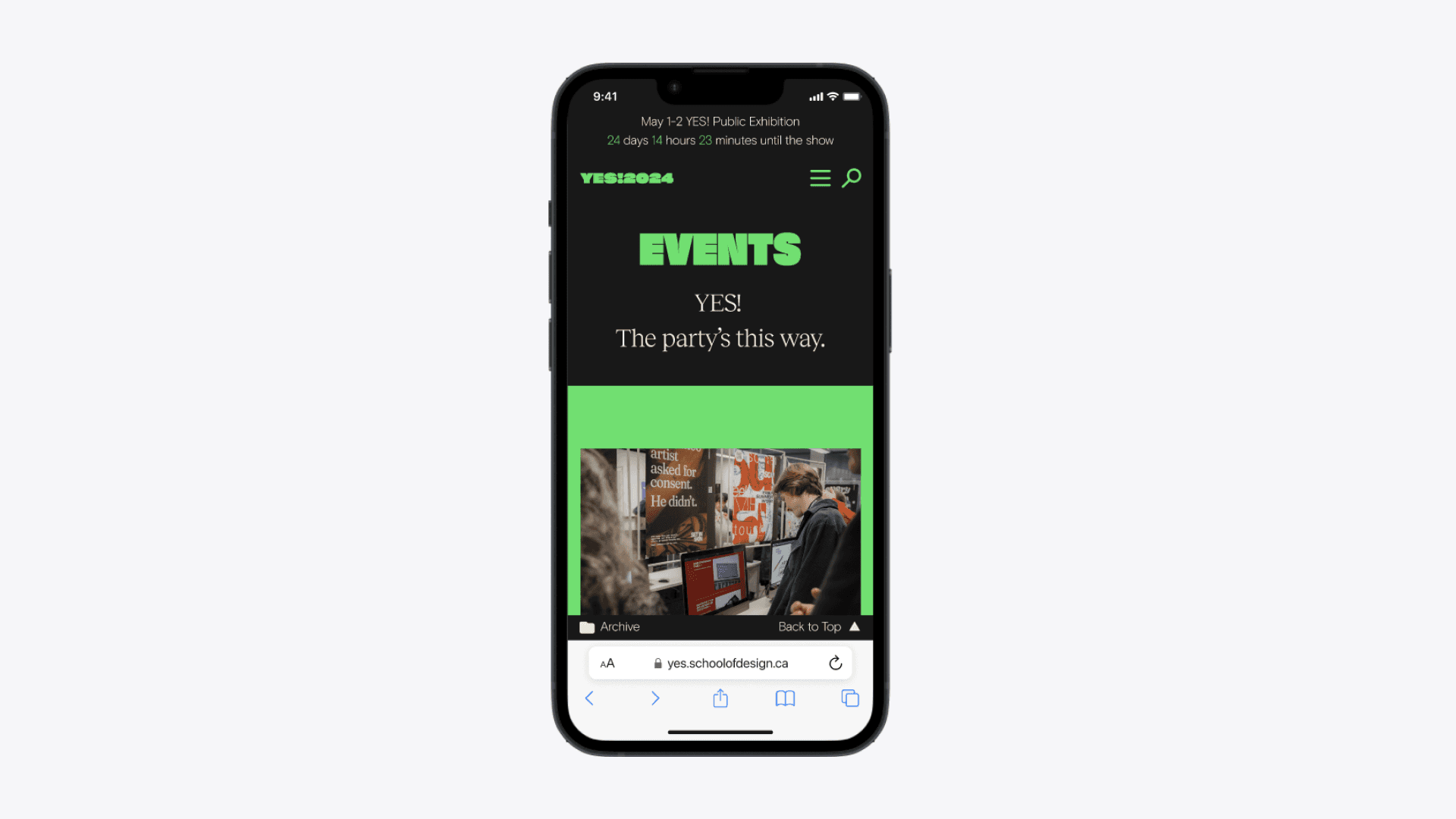
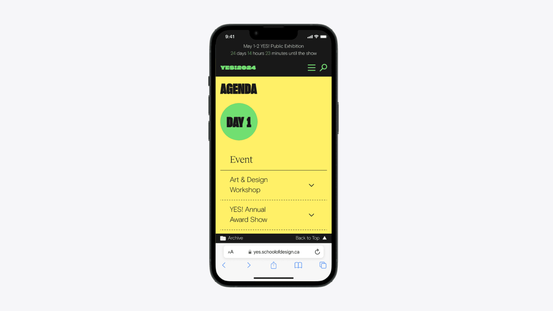
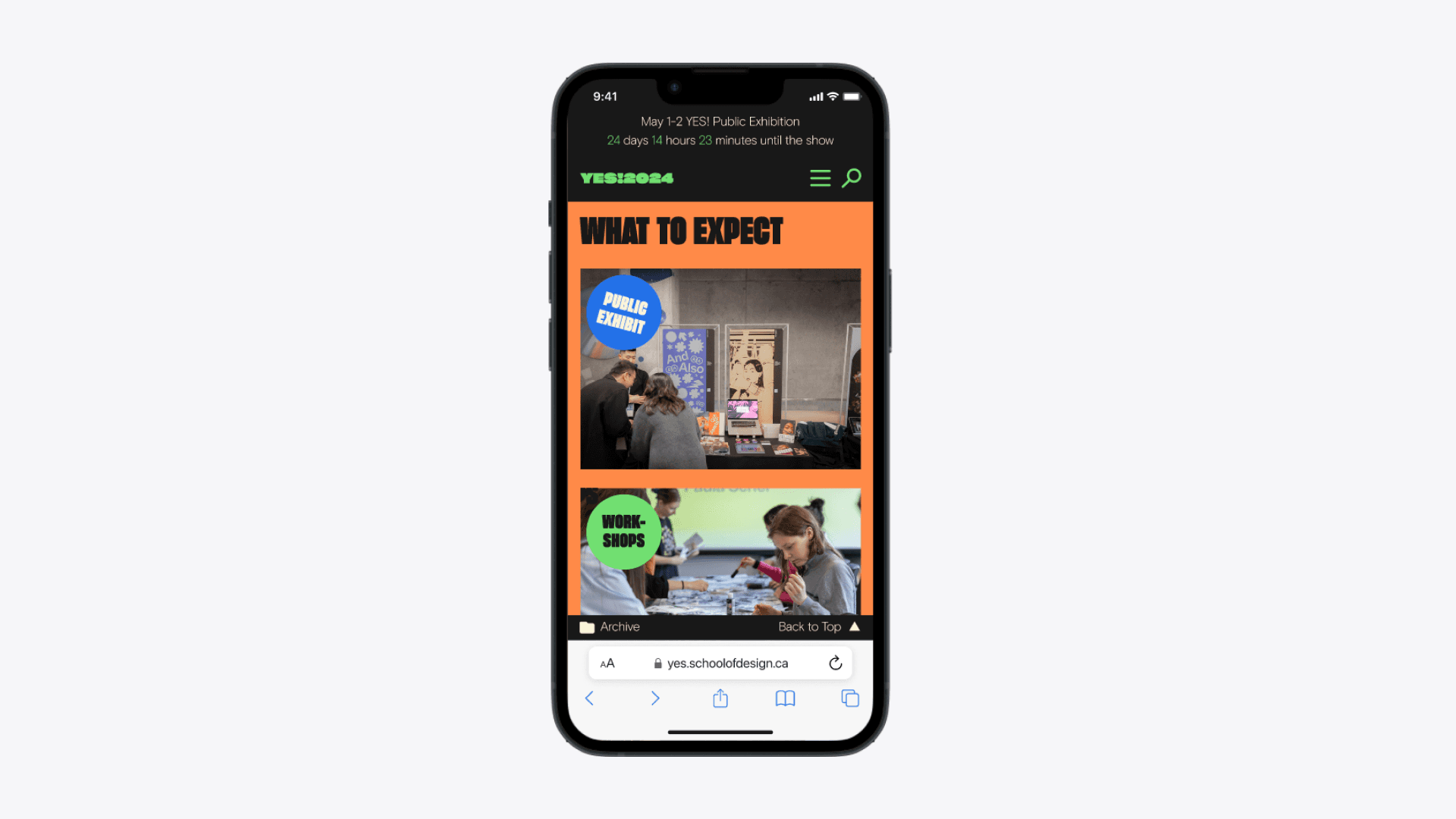
Solution 3
Simplified event browsing and information access.
The Events page minimizes scrolling by enabling users to expand/collapse relevant info, with details such as date, time, location, and directions clearly presented.
Impact
The usability tests after the launch of the new website proved measurable improvements in usability.
Overall effectiveness rate, an increase from 92% effectiveness rate compared to the old website.
Average time spent to complete a task, a significant improvement compared to 106.2 seconds.
Overall satisfaction rate, a significant improvment to the 71% satisfaction rate from the previous score.
Takeaways