UX/UI
Responsive Web
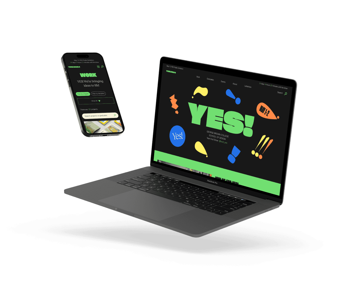
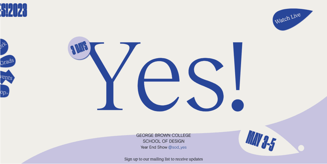
YES! Website
I don't know how you got here but…
I don't know how you got here but…
Redesigning the graduation showcase website
This case study is made for desktop mode.
This case study is made for desktop mode.
See you there!
Role
UX/UI Design
UX Research
Design System
QA
Outcomes
96% effectiveness rate
64.3s average time on task
88% satisfaction rate
Team
4 Designers
1 Developer
Duration
3 months

The Problem
Despite its visual appeal, the previous year's website faced significant usability challenges, leading to confusion for users navigating event details and affecting their overall experience.
The Solution
Enhanced student work visibility and navigation.
The Work overview page features improved navigation with an organized layout, better filter visibility and a prominent search bar, allowing users to easily browse through projects.
Improved work page layout for better work presentation.
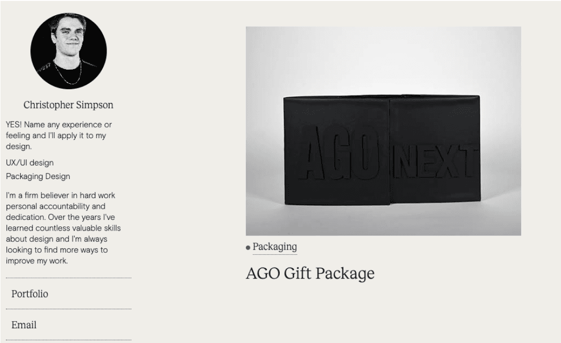
The Work details page features an organized layout via proper information structure with visual clarity regarding student name, student photo, program/discipline and the story behind their work.
Simplified event browsing and information access.
The Events page minimizes scrolling by enabling users to expand/collapse relevant info, with details such as date, time, location, and directions clearly presented.
Process

Discovery
User Research
Kicking off the project with primary research and effective teamwork.
Time was tight, so the website committee split into three subgroups with each using different research methods to maximize efficiency. The methods included user interviews, competitive analysis, and usability testing. I led the usability testing group.

“Who would be visiting our website, and what would be their needs and primary actions?”
In order to conduct user interviews and usability testing, our first step was to define the core users of our website. This was a crucial step before conducting user research, as it allowed us to identify and engage with individuals from these user groups for our primary research and insight analysis.

User Interviews
Semi-structured 30-minute interviews with the key user groups.
At the initial stage of our research, the user interview team asked 5 participants from key user groups to get to know their opinions of the YES! website. We organized the insights into three main categories: Information & Design Clarity, Content, and last but not least, Navigation & Usability.
Information & Design Clarity
Insufficient Info About YES!: Many users were unsure of what YES! was even after going through the landing page.
Lack of Depth: One example was that the graduates' page was described as "empty", with poor placement of their bio and a lack of case studies.
Redundant Elements: Redundant elements, such as a moving bar with programs already listed elsewhere, detracted from the page's usability.
Content
Unclear Typography: Adjustments were needed for typography on the home and graduates' pages due to bad readability from clashing with the background.
Inconsistent Interactions: Inconsistent cursor interaction led to confusion, highlighting non-clickable areas and disrupting the user experience.
Excessive Design: The excess of design elements and oversized components overshadowed the website's visual appeal.
Navigation & Usability
Overlooked Filters: Filters in the graduate directory were largely seen as unhelpful, as users preferred scrolling through or searching for specific graduates.
Confusing Navigation Bar: The left side placement was confusing, sometimes hiding profiles and making it difficult for users to locate important navigation tools.
Summarizing our findings into insights to better understand user needs.
Since participants gave pretty in-depth feedbacks, we wanted to summarize them so it would be easier for us to grasp a starting point. Having a summarized feedback helped us see the current problem from a higher level.
Enhancing Clarity & Navigation
Streamlining Filtering System
Maintaining Consistent Elements
Usability Testing
Preparing for usability testing sessions, starting with task planning.
Having planned and facilitated usability tests before, I was familiar with the NN Group’s recommendations. We conducted remote moderated sessions with 5 participants, each completing 5 tasks. Participants were given a realistic scenario of the personas they were well suited for, and each test was approximately 45-min long.
Task #1
Scrolling through the landing page
Problem 2
Finding when/where the event takes place
Problem 3
Finding work based on type and program
Problem 4
Looking for student info page
Problem 4
Finding work done by specific student
What does our user demographic look like?
During the pre-test interview, we asked basic demographic questions to our participants since they were a good representation of visitors to our website in general. Here's what we learned about our user demographic:
Average age of participants was 27.8 years old
2 out of 5 participants have attended YES! in person
Average tech proficiency of participants was 94%


Gathering quantitative insights by measurement based on ISO standards.
Through the testing sessions, we were able to measure the website's usability issues based on its effectiveness, efficiency, and satisfaction rate. The numerical data we collected and analyed was to be used for comparisons and validations of our future design choices.

Completion Rate
Tasks 1, 2, and 4 scored 100%
Tasks 3 and 5 each had critical errors, bringing them to 80% completion rate

Error Rate
Measurement N/A for Task 1, as it does not involve an end goal
Tasks 3 and 5 came lowest in score in terms of effectiveness

Time on Task
Average time spent per task was 106.2 sec, which equals to 1.77 min
Total time completing the tasks was 531 sec, which is 8.85 min
Satisfaction Rate
Overall satisfaction rate was 3.55 out of 5, equaling to 71%
Qualitative insights were gathered based on post-task and post-test questions.
While the quantitative data provided accurate scores, understanding the "why" behind the numbers was crucial. After each task, we asked participants follow-up questions to gather their opinions and any additional feedback. Once all 5 tasks were completed, we concluded with 5 post-test interview questions.
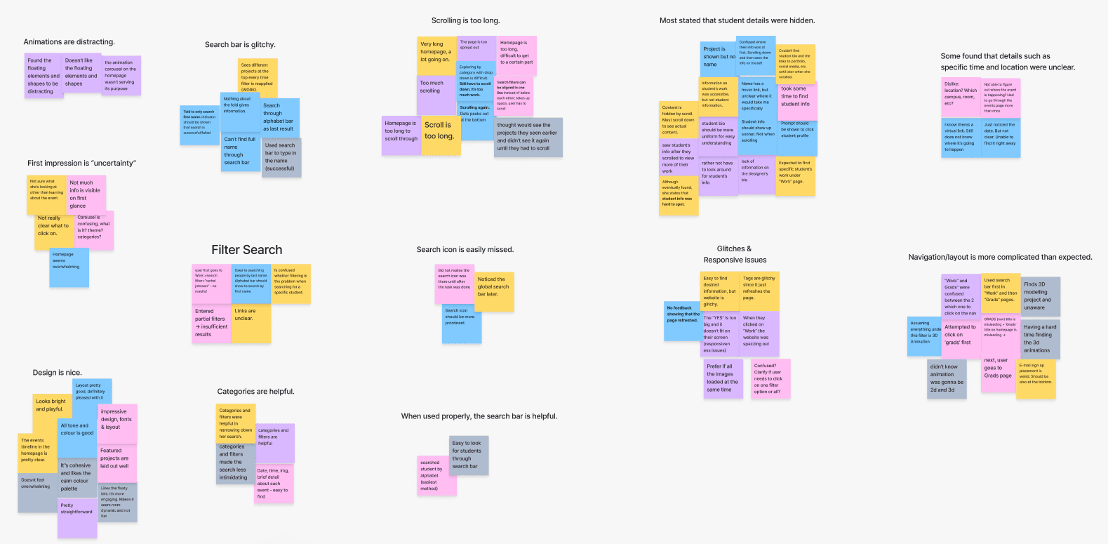
Insights & Analysis
Feedback from the tests was documented and analyzed in FigJam to identify common themes
Common themes included distracting animations, long scrolls, glitches/responsive issues, complicated layout, cohesive design, etc.

Sentiment Score Chart
Measures positive and negative feedback, providing an overview of areas for improvement
Overall user sentiment score was derived by quantifying feedback from post-test interviews on key themes
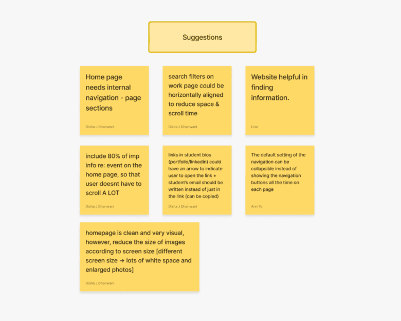
Suggestions
Suggestions were also grouped for quick understanding of user needs and wants
Feedback was diverse, covering internal homepage navigation, layout adjustments to reduce scrolling, and improved responsiveness
Define
Project Goal
Setting goals to make the website more user-friendly and effective in promoting the event.
The primary goal was to revamp the website into a more user-friendly version, but it was equally important to consider the value it would provide beyond direct interaction. For many users, the website could be a first impression of the school and the event in general, so its presentation could have a major impact on some users’ decision to attend the event or not. Thus, we came up with 3 main goals to tackle.
Improve Usability
Address the feedback from users about usability issues from the previous website and implement changes to elevate the user experience.
Increase User Engagement
Design the website to encourage user interaction and engagement via enhanced features, added animation, etc.
Enhance Event Promotion
Ensure that key information about the event is easy to find and well-promoted, helping to boost participation as well as website traffic.
Success Metrics
Tangible goals that can be measured with accuracy.
To ensure the revamped website achieves its objectives, we established clear and measurable success metrics. With usability testing for the newly designed website still underway, these goals will help evaluate the effectiveness of the design once testing is complete.
While we don’t have previous KPIs to compare to, we plan to use usability testing scores to compare the old and new websites based on the following quantitative and qualitative goals:

Ideate
Sketching

A neat sketch by a committee mate!
Pen and paper to brainstorm for the website teaser page!
The committe lead had already established this year's branding in the beginning, so we jumped into sketching ideas for the teaser page. The teaser page was a preview version of the website that was to be launched to the public in hopes of bringing anticipation for the event and the final version of the website.
Our sketches were pretty messy, so we had to draw one final good copy to keep record of our idea😂
Wireframing
It was crunch time; we were already past the first half of the semester.
Once the teaser page went under development, we immediately started to design the full website. Each committee member was given a major section of the website to redesign. I was in charge of improving the Work pages (main page and inner page) which was a gallery of graduate work.
While working on the Work page, I was also tasked with the Events page after a committee member left to assist another team that needed urgent help. Knowing many users would access the site on mobile devices, I designed the layout with responsiveness in mind to ensure it was mobile-friendly.

Iterations of the Work (inner) pages
Collaborating with design & programming professors
Design
Component Library
Creating a component library that streamlines the design and development process.
Due to the time constraint, we didn't think it was a wise decision to establish an entire design system, as we worried this process would take a long time. Instead, I created a component library that contained the necessary elements that we would use to make hi-fi prototypes.

Typography, Colours, CTAs, and Form Elements
Hi-Fi Prototype
Implement
Quality Assurance
Problems kept surfacing — even after the website launched.
Once the hi-fi prototypes were ready for handoff,we identified and prioritized issues that appeared in the testing environment. With the launch approaching, we had to make sure the final build met our acceptance criteria. Being used to using other tools for managing QA, I found FigJam surprisingly versatile.
Some issues came to surface after the launch, which was a challenge as the website was already getting visitors. There was a bug with one of the font types, which appeared completely different on mobile devices compared to desktop. However, with the expertise of our developer and continuous back-and-forth of checking to see if the issue was solved, we were able to successfully launch the website!
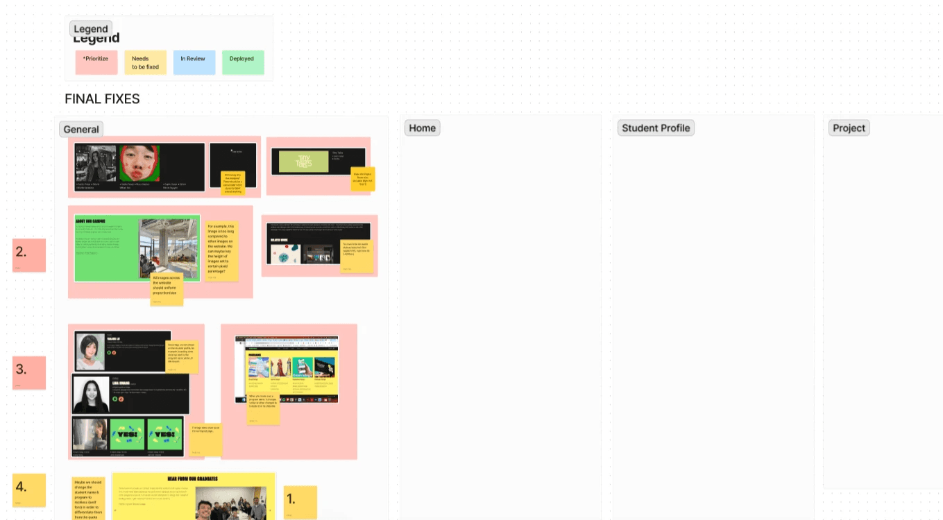
QA process organized by prioritization
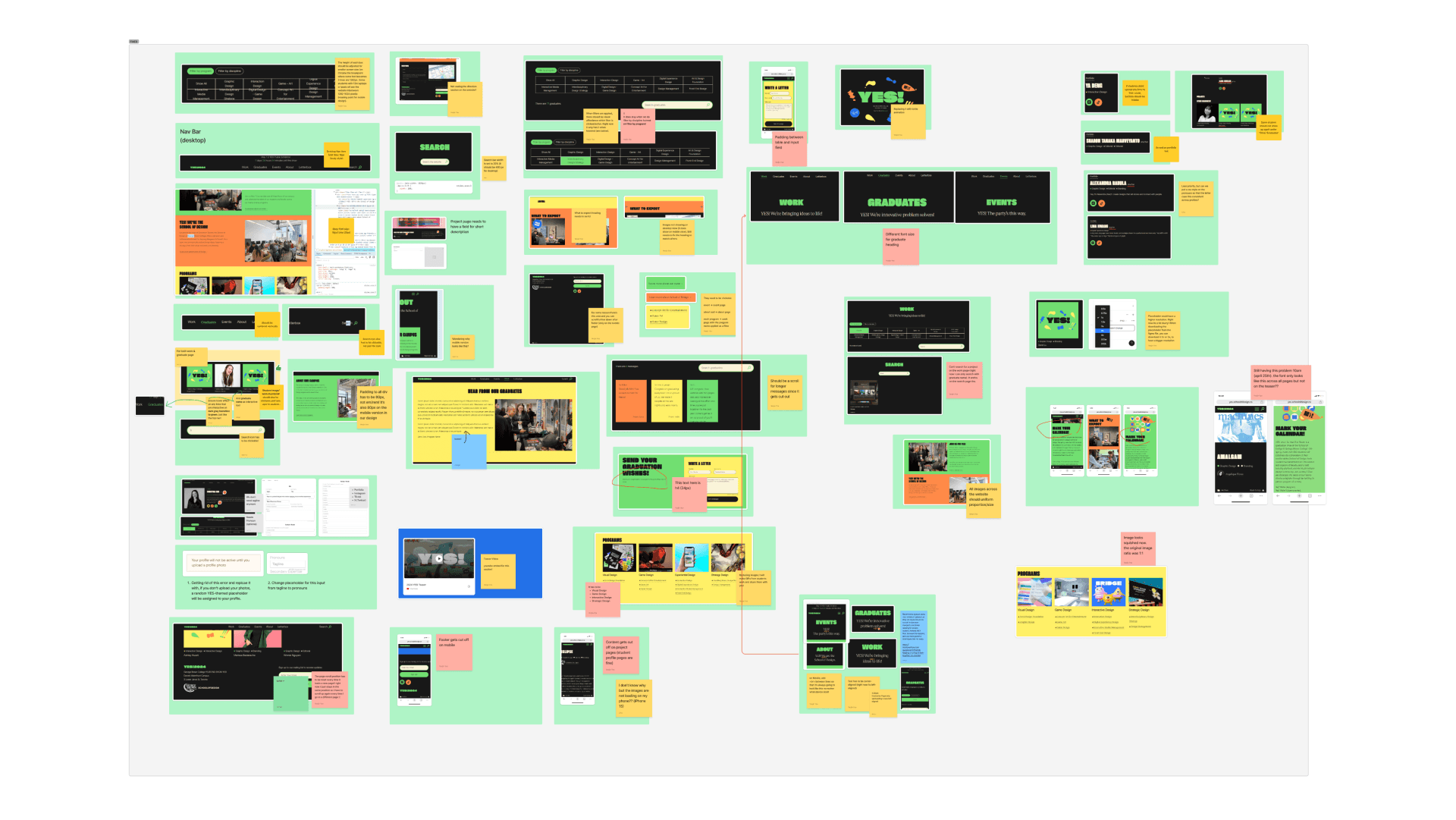
The "fixed" bin for resolved issues
Before & After
All our hard work paid off, and it was time to showcase the improvements we implemented.
The site-wide changes to the website included:
Moving the navigation bar from the left-hand side to a top-center position for better content focus and easier navigation
Keeping the countdown visible on all pages
Making the search bar more prominent by increasing contrast and adding "Search" text beside the icon
Below are the before and after shots of the Work page. We kept the grid layout to focus on visuals, but made key changes such as replacing dropdown filters with tab filters for better visibility. The dropdown required too much scrolling, so tab filters made searching easier. We also added tags for program and discipline, which work with the filters to display relevant student work when clicked.
Before

After

Below are the before and after shots of the Events page. The previous layout spread events across the entire page, making it hard to navigate and search for specific events. Due to the design being static, it also lacked excitement. In the improved version, we introduced expandable/collapsible rows to give users more control over the information they wanted to view. We also added images from last year's event to build anticipation and make the page more dynamic.
Before
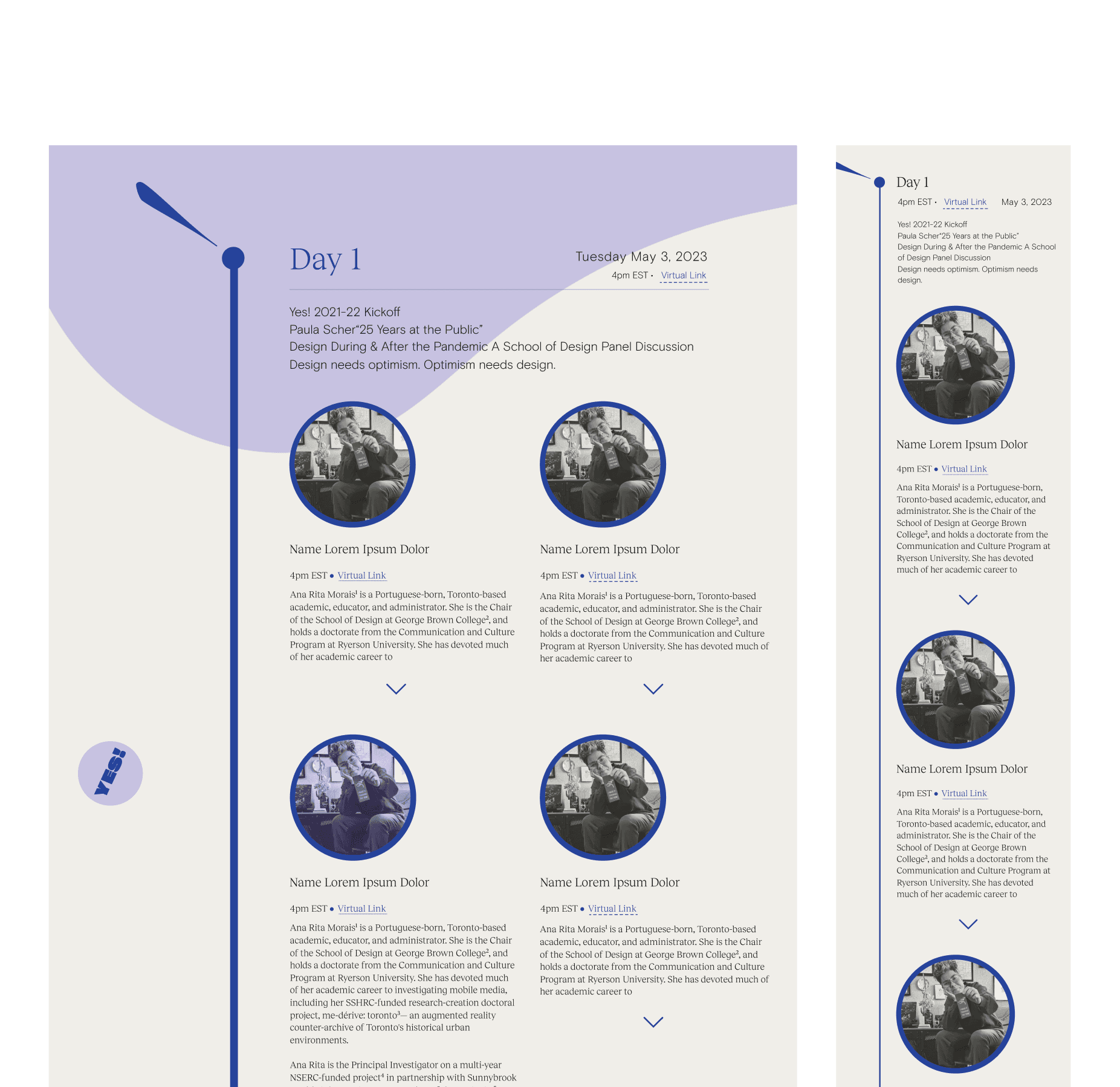
After

Conclusion
Learning the importance of research-based iteration.
Starting from usability tests and analyzing user insights to ending with QA and deployment, the YES! website redesign helped me significantly grow as a designer in a short span of time. Being a 4th year student, working on this project while balancing various tasks during busy semesters was both challenging and rewarding.
Another key lesson I learned was the importance of task delegation. When some members had to leave the committee mid-project due to school commitments, their tasks were reassigned to the remaining members. This required us to regroup and go through another round of planning to ensure nothing fell behind.
There were also times when committee members disagreed on design choices. During these times, we used a pen and paper to sketch out our ideas, which made me realize the effectiveness of traditional tools in collaborative brainstorming.